This is the first post in a series describing different types of illustration techniques - from simple scribbles, to parametric CAD models and photorealistic renderings. In this post, we will focus on the genesis of a new idea; the Napkin Sketch.
Time to Draw
For context, I’m a designer and I suck at drawing. A science geek who happened to like making things, my process has always consisted of scrawling out crude action plans, gathering a bunch of materials, and jumping right into the physical building.
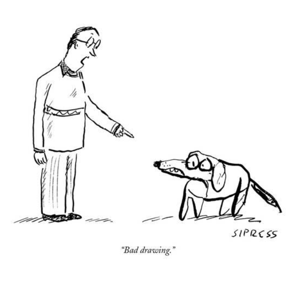
David Sipress for The New Yorker, November 29, 2004. https://bit.ly/2uxw72w
I spilt no ink when creating an entrance portfolio to get me into design school, but once I got there, there was no escaping it - from 5-minute sketches to full blown hand renderings, I would watch disheartened as my classmates cranked out museum quality illustrations that made my deliverables look like steaming turds.
It was a struggle. I couldn’t ‘see’ my ideas as 2D drawings, much less, draw a straight line. When I paid my prof a visit to discuss my shortcomings regarding hand illustration, he said something that completely changed my outlook on 2D representation:
‘Drawing is foremost about communication. It’s about making others understand what you’re proposing. Hand-drawing, specifically, is an irreplaceable tool to work through a design, and communicate the features and form of your concept quickly - beyond the low-fidelity sketch, there are alternatives for producing drawings that sell and excite - i.e. presentation drawings. Focus on the Napkin Sketch as far as hand-drawing goes.’
What a load off! I started concentrating more on ideas, and leveraging my CAD skills when high-fidelity illustrations were required. I even went as far as making physical models of some projects and tracing over photographs of them to produce high quality hand-renderings. It wasn’t practical, but I graduated top of my class, steaming turd drawings or not.
Thankfully, at ZED, we have a team of designers practiced in a variety of sketching and illustration techniques. Our diverse skill-set allows us to deliver an array of illustration types, each serving their own unique purpose.
Today, we are exploring the seed of the drawing world - the Napkin Sketch.
The Napkin Sketch
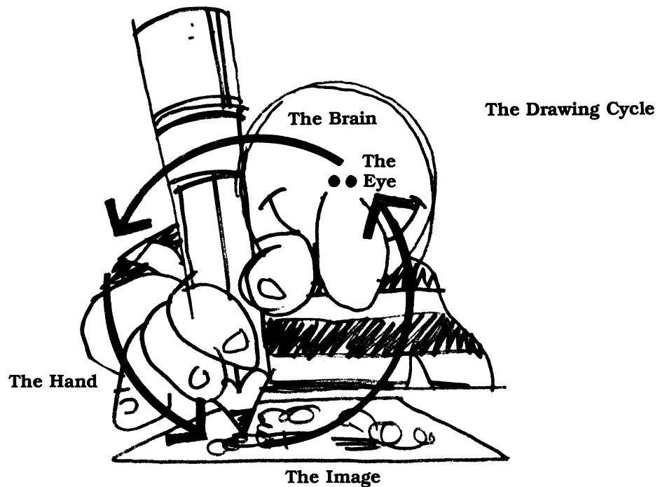
Kurt Hanks - Rapid viz: a new method for the rapid visualization of ideas
Across all industries, the Napkin Sketch is the first step in bringing an ephemeral idea to reality.
It is a quick illustration, sometimes on a napkin, that describes at a glance the chief qualities of a concept. Beyond their descriptive qualities, these quick sketches help us work through a concept. Kurt Hanks, the author of Rapid Viz: A New Method for the Rapid Visualization of Ideas, describes this process as a dialogue - as the sketcher begins to externalize the thoughts in their head, a new perspective emerges on potential pitfalls and opportunities of the proposal.
The Napkin Sketch in Architecture
Napkin Sketches vary tremendously depending on the scale, scope (whole or part), and function (building, handheld product, system...) of the subject.
For example, when describing a whole edifice, Napkin Sketches are often low-fidelity shadows of an idea - conveying the tone, air, and spirit of a proposal. Here’s Daniel Libeskind’s Napkin Sketch of the Royal Ontario Museum in Toronto with the finished building shown below:
Daniel Libeskind - ROM Napkin Sketch - Retrieved from https://bit.ly/2bLgxGv
© Elliot Lewis Photography - retrieved from https://bit.ly/2kh8MKP
The sketch is so successful in its execution that any Torontonian could tell immediately that Libeskind’s ‘scribble’ is the ROM. Even more impressive is that Libeskind’s initial proposal for the project consisted solely of a set of eleven napkins, one of which is pictured above.
The Napkin Sketch in Industrial Design
As the subject’s scale diminishes and its tactility increases, the level of detail of the Napkin Sketch rises. Take this sketch of the eero WiFi router by Fred Bould - he describes and explores the shape, material, branding, and use features for the router with enviable grace and ease:
Fred Bould - Eero Router - Dwell, Vol. 15 Issue 07 - retrieved from https://bit.ly/2Gm1YER
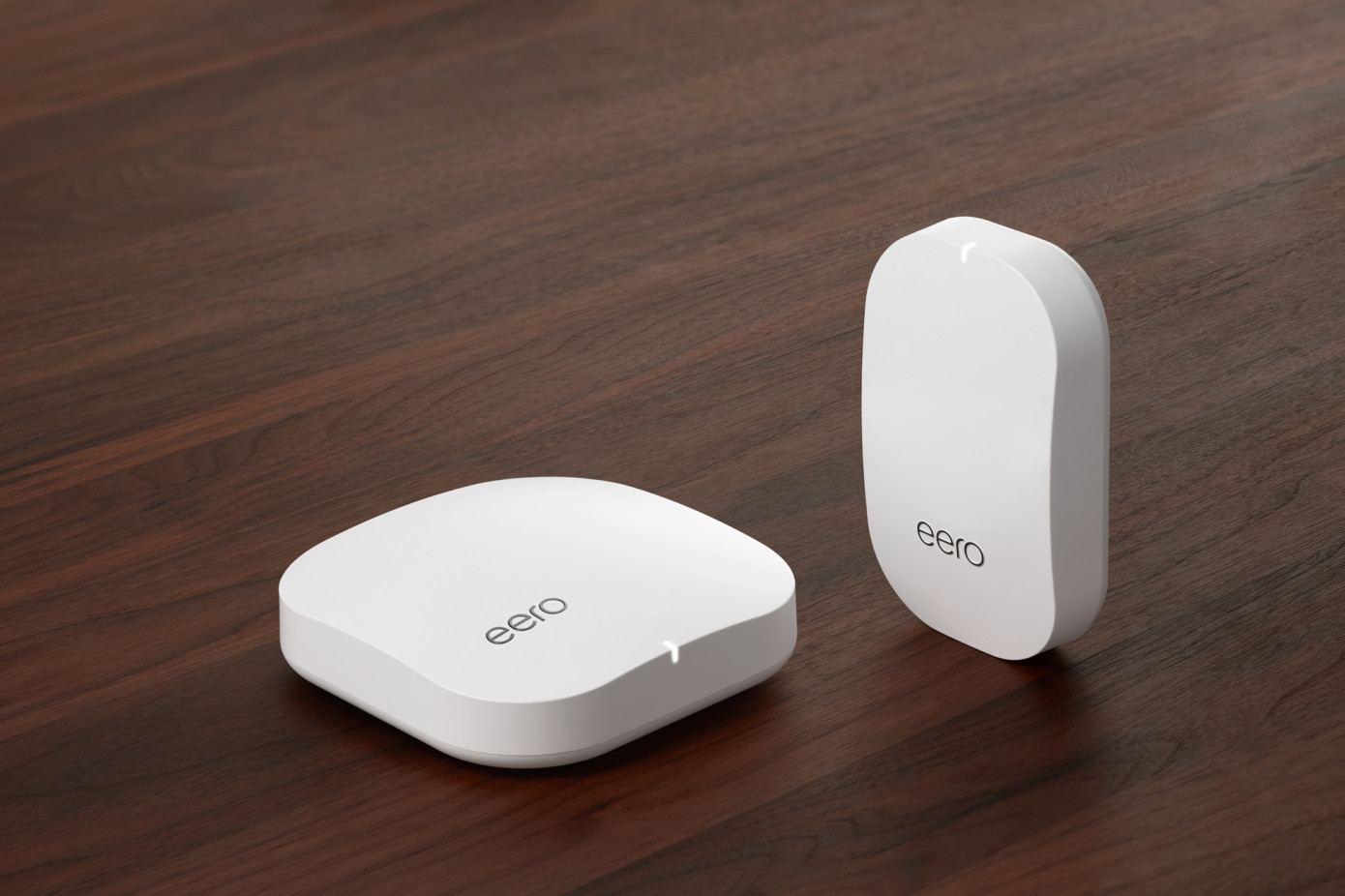
The final product embodies the grace of the sketch, barely drifting from Bould’s simple illustration:
eero router - retrived from https://tcrn.ch/2tgJzCn
The Napkin Sketch in Systems Design
There is an ongoing gag in Silicon Valley that all you need to make your fortune is a rough idea (i.e. Napkin Sketch), and a garage:
Robert Zeidman - Entrepreneurs' Napkin - Photo by Mark Richards - retrieved from https://bit.ly/2GhC6ya
The above specimen from the Computer History Museum is a tongue-in-cheek gag by electrical engineer Robert Zeidman, however it is deeply rooted in reality.
Open Compute Project PSU - Jay Park - retrieved from https://read.bi/2pNbP0g
Systems engineers use Napkin Sketches extensively to work through problems, and describe proposed hardware configurations. Ranging in level of detail, these sketches are at the heart of some of the tech industries biggest fortunes.
Take a look at Jay Park’s illustration for Facebook’s data center power supply. This late night sketch, scrawled out by Jay Park as he was falling asleep, depicts what is now the lifeblood of the Open Compute Project system’s highly optimized data centers. This very architecture is now used by Facebook, Google, Cisco, Alibaba…and many, many more internet giants.
The Napkin Sketch in Business
Even in business, where words are king, diagramatic representations are deeply entrenched - though, perhaps more of a sales tools than a core component of the thought process. Take, for example, Rollin King’s simple sketch that spawned Southwest Airlines, one of the most profitable airlines in America. Drawn over a drinks with lawyer Herb Kellecher, King’s sketch illustrates his seemingly simple, but actually revolutionary idea of connecting Texas’ three main metropolitan cities. Perhaps as an homage to its roots, Southwest Airlines’ napkins now depict a (much larger) diagram of the cities it serves.
Retrieved from https://bit.ly/2J1bRtg
The Napkin Sketch in UI and Advertising
At ZED, we use Napkin Sketches (or thumbnail sketches) extensively in generating, and communicating ideas. Internally, and with clients, this stage of design is crucial to our process.
Here's a preliminary sketch of an advertisement we created for Gildan:
The actual execution of the ad (especially back in the 90s!) was very labor intensive, however the communication of the concept to the client only took a 5-minute sketch. Here's the final product:
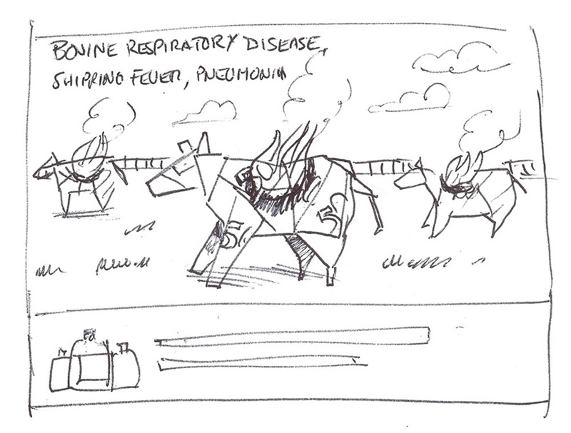
Another great example is our campaign for Merck Pharmaceuticals’ Bovine Respiratory Virus - once again, the 5-minute sketch and the finished product:
Some of the concepts don’t go to production:
But their quick nature allows us to communicate a multitude of concepts without spending a huge amount of time.
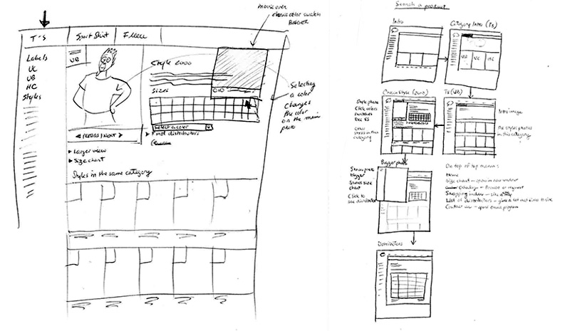
We also use sketching extensively in the development of User Interfaces for websites and apps.
In the context of UI, we use these sketches mostly internally as a tool to work through user flow. Once we land on something the team likes, we mock these up as navigable wireframes to give clients a clearer perspective on the interactions.
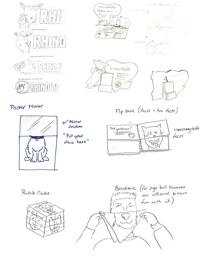
Sometimes, we use Napkin Sketches to develop characters for our ads, which we then vectorize, and use in bigger concept-pieces as seen on the right.
Even in our merchandising, point-of-sale, branding, and tradeshow design - nearly everything we produce starts as a Napkin Sketch:
It’s a fun way to communicate ideas, and an indispensable tool to our client’s success.
Give us a call today, and let us sketch a picture of what ZED can do for you - we’ve got lots of napkins.

